
A few years ago, many web pages were still “optimized” for a specific resolution. These times are over since the triumph of mobile devices such as tablets and smartphones. Today, web pages are generally designed to be “responsive”. A web page is called “responsive” when the page elements such as texts, text blocks and images adapt to small display sizes without simply making the content smaller.
In the case of a reduced display area, the following rules apply to the content:
- The font size does not scale or scales only slightly.
- The content is structured in blocks that become narrower and taller.
- Content blocks that are next to each other horizontally arrange themselves vertically below each other before they become too narrow.
- It is basically avoided the scroll bar (scroll bar) for the vertical scroll movement.

Fortunately, this largely puts an end to the days when the smartphone’s zoom function had to be used in the manner of a magnifying glass in order to even read a page that had been shrunk down on the smartphone.
Responsive App Design

The procedure for the responsive design of web pages can be excellently transferred to hybrid apps. A responsive web app is called “hybrid” if it can also be published in the app stores through a native framework (which also enables the use of the camera and sensors). The images with the coffee maker show a successful product presentation from an online store for three different width devices.
If you want to offer apps for your customers, you can (have) them developed for Android, iOS or Windows, or platform-independent. Developing for one platform is called “native” development. Native development lends itself to compute- and graphics-intensive apps, such as games, because the computing power of the mobile device can be shared.
Cost-effective hybrid apps
For typical eCommerce applications, such as store or booking systems, on the other hand, the key is to transmit up-to-date data and reach customers on your individual device. Here, developing a web application optimized for app operation can be much cheaper, especially in terms of maintenance. The platform-independent development of a web app uses web technologies (with HTML, CSS and JavaScript web standards). Embedding the web application in a native framework for installation in the app stores is sufficient to serve the different platforms. Changes to the application, on the other hand, need to be made only once and not per platform.
Even though the terms “web application” and “web app” have the same linguistic meaning, the term “web apps” is often used when the application has been developed primarily for use with the smartphone.
What is the current situation with web applications and web apps when they are used on a smartphone or tablet? Similar to web pages, here the applications often just respond to a larger display by increasing the size of the page elements or the spaces between them. Thus, a real feeling of adaptation to the available space does not arise.
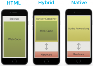
Developing hybrid apps with a web application at the core (center image) is more affordable because you can reach more customers with one solution. This is because your app offering can be used through desktop browsers on the web, as well as a hybrid app for Android, iOS, and other operating systems. If you have a development department with web developers, you can even handle the maintenance of the responsive web app yourself, without having to get into the details of developing for mobile devices. Using products such as rAPPit, which already provide the basic functions for app development, allows you to quickly get started developing device-independent responsive apps.


Written by Jessica Schlechter on January 28, 2016